Use Case: Label Repair Console
Create one polished public-gallery concept image titled exactly "Use Case: Label Repair Console". Output format: one 16:9 high-re...
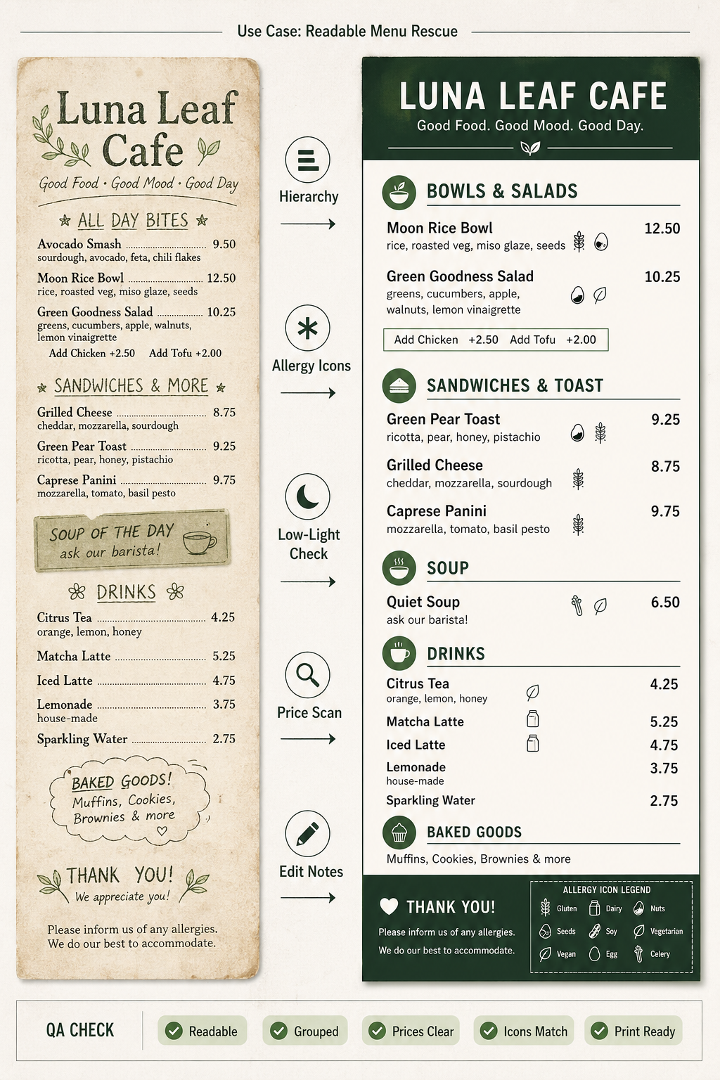
把 GPT Image 2 用在虚构餐厅菜单重排:从低对比、装饰字体和松散分组的旧菜单,生成可打印的高对比层级、清晰价格、可见过敏原图例和底部 QA 通过条。
Use this as a reference for Accessibility, Allergen Icons, Low Light Readability, Menu Design workflows, prompt structure, visual constraints, and output review.
Create a single finished GPT Image 2 use-case demo image, portrait A4 ratio, titled in small crisp English text: "Use Case: Readable Menu Rescue". Show a fictional, unbranded neighborhood cafe menu redesign workflow as a print-ready before/after proof sheet, not a product photo and not a grid of prompt tags. Left third: a faded fictional original menu named "Luna Leaf Cafe" with intentionally cluttered but readable placeholder sections, no real logo. Center: a clean transformation lane with short labels: "Hierarchy", "Allergy Icons", "Low-Light Check", "Price Scan", "Edit Notes". Right two-thirds: the final accessible menu layout for the same fictional cafe, with clear large typography, high contrast, grouped sections, simple invented dishes such as "Moon Rice Bowl", "Green Pear Toast", "Quiet Soup", "Citrus Tea", and visible allergy-safe icon legend using abstract symbols only. Add a small QA strip along the bottom with check chips: "Readable", "Grouped", "Prices Clear", "Icons Match", "Print Ready". Style: polished editorial design mockup, realistic flat-lay scanner proof with paper texture but primarily a graphic workflow, sophisticated but not luxury-brand, no real brands, no people, no copyrighted characters, no political content. Make all visible text short and legible; avoid tiny paragraphs.
Source note: Original fictional accessible-menu workflow and prompt generated locally after external source sweep. Sources informed abstract menu workflow, accessibility failure modes, dense-text evaluation, and human preference/evaluation patterns only; no external prompt text, image, brand, character, artwork, protected style, or source image was reused.
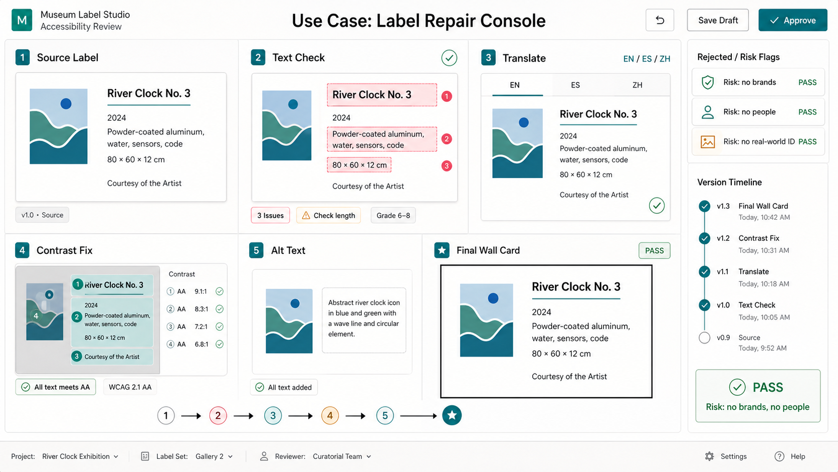
Create one polished public-gallery concept image titled exactly "Use Case: Label Repair Console". Output format: one 16:9 high-re...
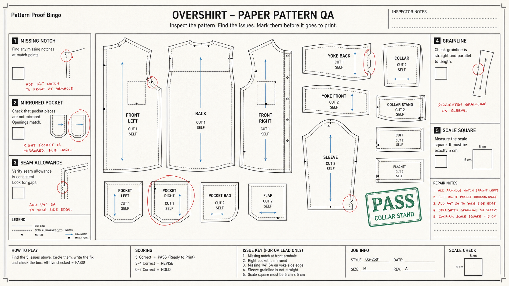
Create one polished public-gallery concept image titled exactly "Derived Play: Pattern Proof Bingo". Use case: derived play mecha...
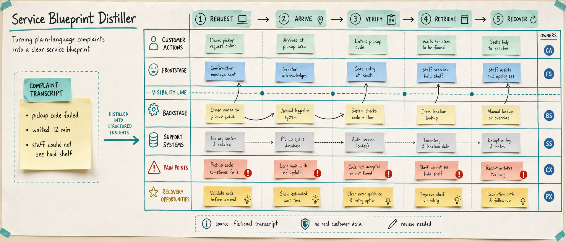
Use case: productivity-visual / service-design workflow Asset type: public gallery image for GPT Image 2 use-case research, ultra...
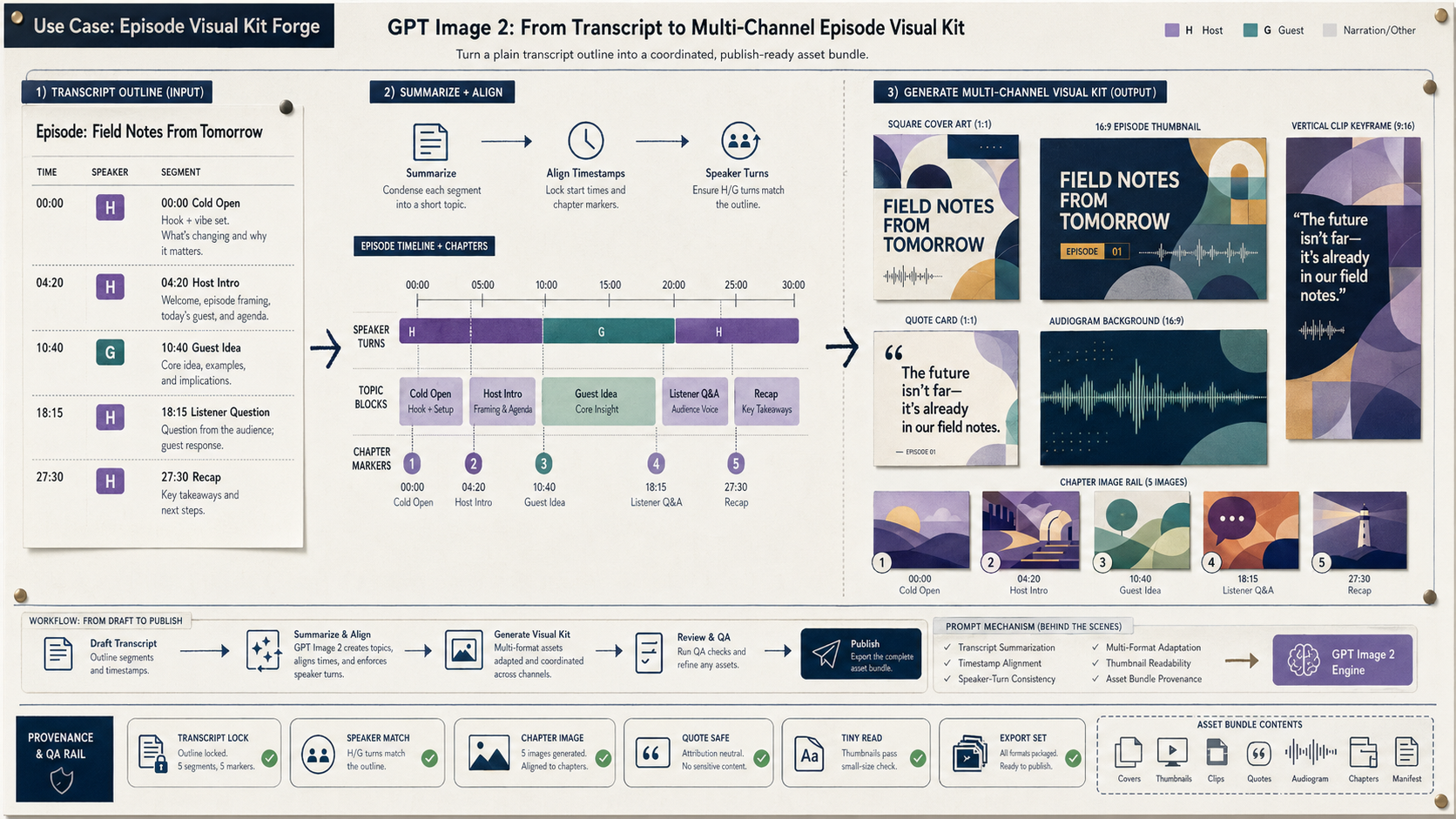
Create a wide 16:9 fictional podcast production artifact titled in small clear text "Use Case: Episode Visual Kit Forge". Show ho...
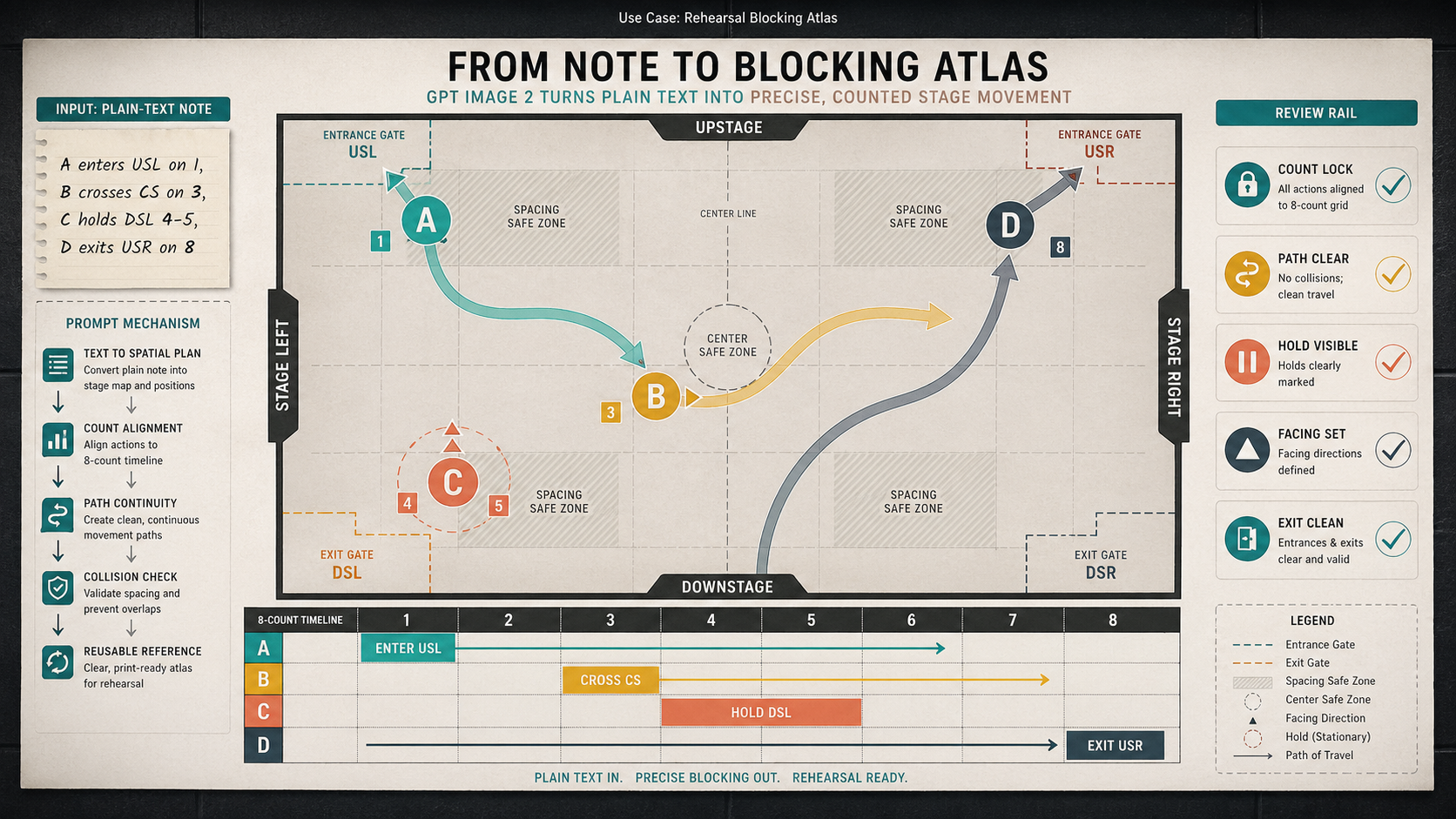
Create a wide 16:9 fictional rehearsal planning artifact titled visually only in small text as "Use Case: Rehearsal Blocking Atla...
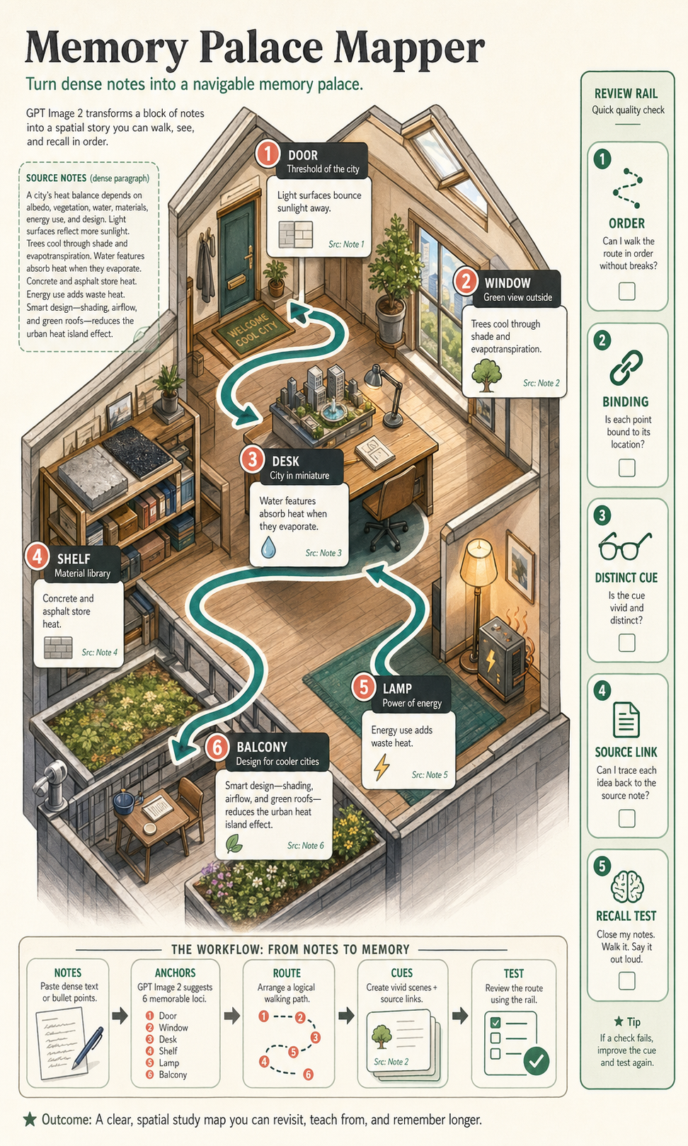
Create a polished, public-gallery image for GPT Image 2 use-case research. Use case: scientific-educational / productivity-visual...