Derived Play: Receipt Run League
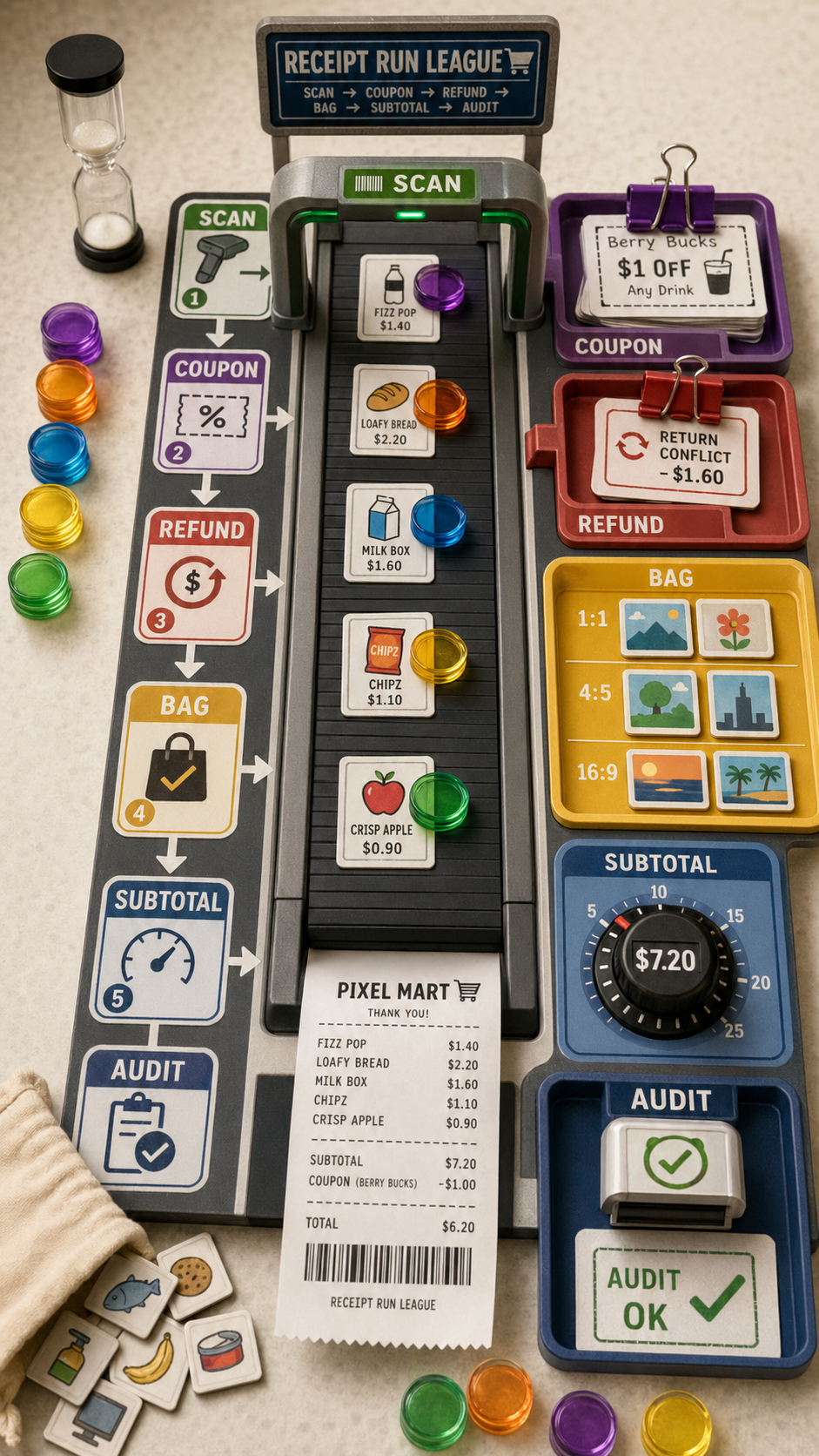
Derived Play: Receipt Run League Asset type: vertical 9:16 playable checkout-conveyor board game photograph, not a grid, not a si...
历史生成图,批次 019db8e3-caee-76e3-abe0-1aa1dd51a1ad,生成时间 2026-04-23 14:28:16。
Use this as a reference for Game Design, Lighting and Weather, Photoreal, Product Mockup workflows, prompt structure, visual constraints, and output review.
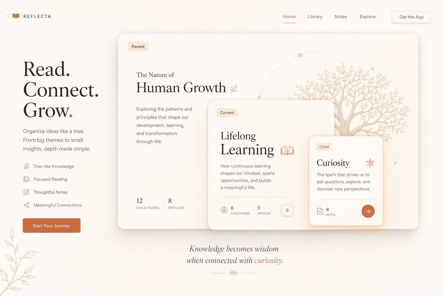
Use case: ui-mockup
Asset type: landing page hero showcase for a reading and knowledge app
Primary request: redesign the parent/current/child three-layer node concept with the CORRECT size hierarchy. The parent card must be the largest background layer, the current card must be a medium-sized card placed above it, and the child card must be the smallest foreground card. All three should read as nested cards getting smaller as depth increases.
Scene/backdrop: airy light-theme landing page section on a warm oat-cream background with subtle paper texture and quiet radial light.
Subject: a large centered product mockup showing three stacked cards. Parent is a wide, dominant background card with broad context content. Current is a clearly smaller middle card centered in front of the parent. Child is the smallest floating detail card in the foreground, positioned slightly to the right.
Style/medium: premium product design mockup, refined editorial interface, calm literary feeling, high-end Figma/Dribbble presentation quality.
Composition/framing: desktop website hero composition, generous whitespace, asymmetric but balanced layout, strong visual focus on the card-size hierarchy. The difference in size between parent, current, and child should be obvious at first glance.
Lighting/mood: soft daylight, warm and intelligent, premium but restrained.
Color palette: warm cream, bone, sand, terracotta, muted amber, charcoal text.
Materials/textures: paper-like cards, thin warm-gray borders, soft layered shadows, subtle terracotta glow around the smallest child layer.
Text (verbatim): tiny UI labels allowed for Parent, Current, Child, but keep text minimal.
Constraints: light theme only; elegant serif display feel mixed with clean sans-serif UI details; no dark mode; no purple; no neon blue; no cyberpunk; no glassmorphism; no stock-photo people; avoid clutter; parent must be visually largest, current medium, child smallest.
Derived Play: Receipt Run League Asset type: vertical 9:16 playable checkout-conveyor board game photograph, not a grid, not a si...
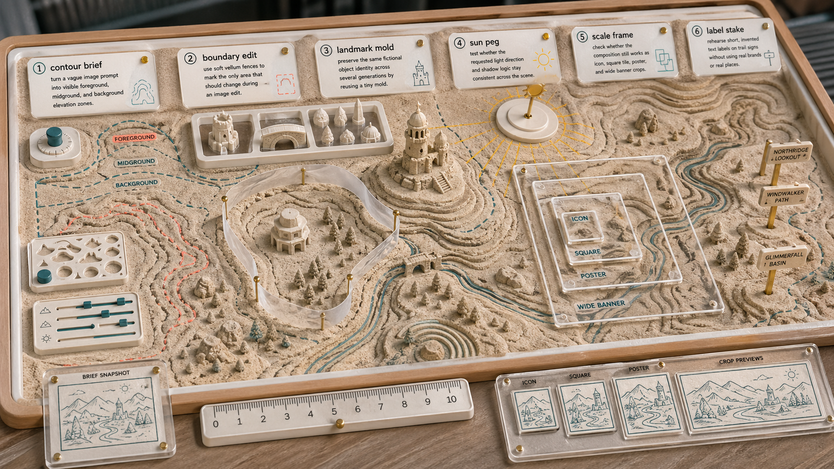
Create a wide 16:9 original GPT Image use-case concept scene titled "Use Case Sandbox: Contour Image Rehearsal". Purpose: visuali...
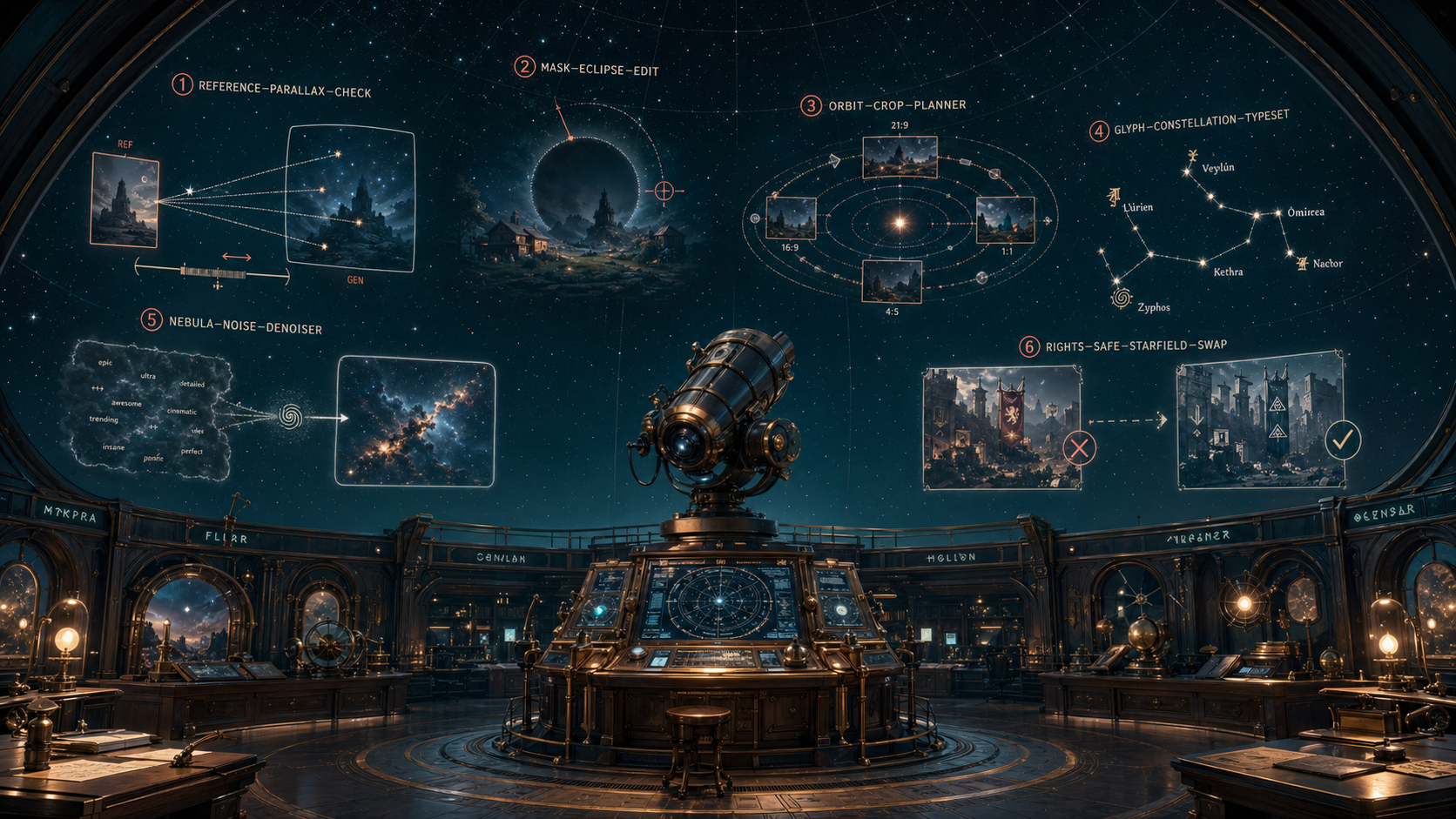
Create a single high-quality landscape concept image titled only through small fictional diagram labels, showing an original GPT...
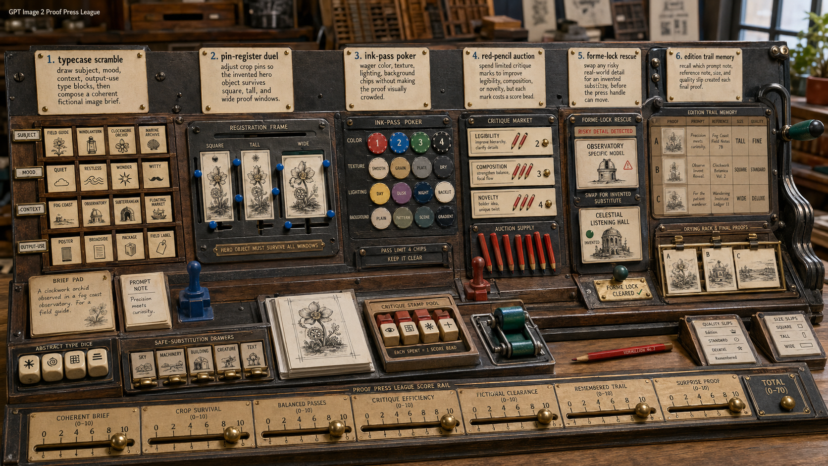
Create one original GPT Image 2 derived-play concept image as a 16:9 landscape scene. Title inside the image, small and legible:...
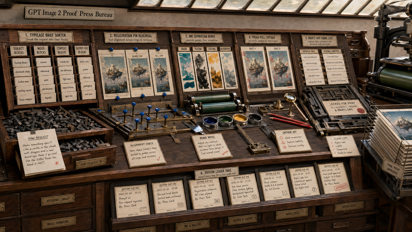
Create one original GPT Image 2 use-case concept image as a 16:9 landscape scene. Title inside the image, small and legible: "GPT...
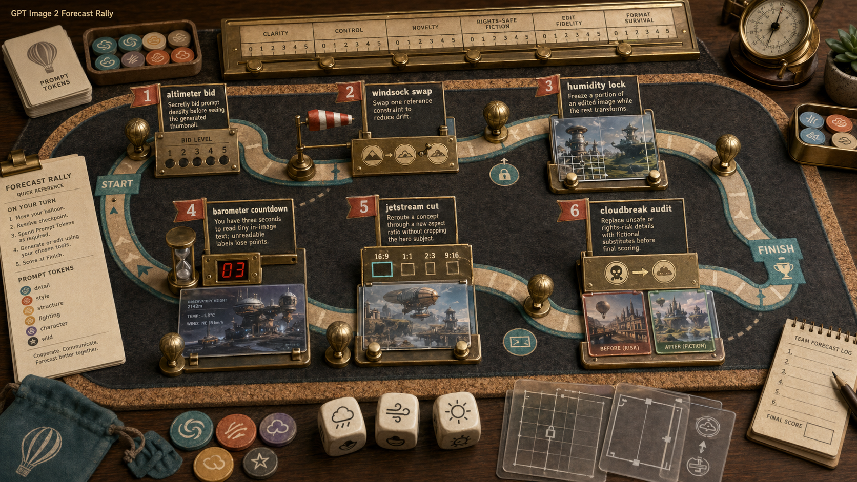
Create one original GPT Image 2 derived-play concept image as a 16:9 landscape scene. Title inside the image, small and legible:...