Derived Play: Token Drift Hunt
Create one polished public-gallery concept image titled exactly "Derived Play: Token Drift Hunt". Use case: ui-mockup / derived p...
一个 GPT Image 2 产品设计工作流玩法:把虚构 Mosaic Pantry PRD 生成四状态移动端 mockup,用 PRD、States、Nav、Tokens、Text、PASS 约束轨道检查导航、token、文本、empty/error 状态,并在 fix empty copy 后盖上 PASS AFTER FIX。
可参考这个示例来设计 Design Token Consistency、Edge Case Testing、Navigation Continuity、Product Design Workflow 工作流、提示词结构、视觉约束和结果检查方式。
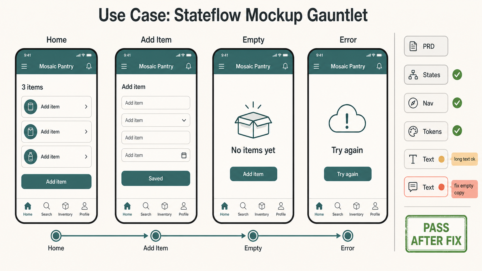
Create one polished public-gallery concept image titled exactly "Use Case: Stateflow Mockup Gauntlet".

Use case: ui-mockup / product-design workflow / visual QA
Asset type: public GPT Image 2 use-case gallery image, landscape 16:9 product-design review wall

Primary request: Show GPT Image 2 being used to turn a fictional product PRD into a multi-state UI mockup that can be reviewed for structure, edge cases, token consistency, navigation continuity, and readable text. This must feel like a real product-design workflow artifact, not a generic dashboard screenshot, not a marketing landing page, not a physical object, not a tabletop game, not a map, not a comic, not a worksheet, not a data poster, and not a panorama.

Scene: a clean digital review canvas for a fictional app called "Mosaic Pantry". The app helps a fictional community kitchen track donated pantry items; keep it generic and non-political. Show four mobile screens arranged left-to-right as one flow, each with a clear label: "Home", "Add Item", "Empty", "Error". The screens share the same top navigation, same tab bar, same 8px rounded components, same typography scale, and same teal/graphite/ivory design tokens. Use invented sample text only: "Mosaic Pantry", "Add item", "3 items", "No items yet", "Try again", "Saved".

Mechanism to make visible: a thin right-side constraint rail lists short QA chips: "PRD", "States", "Nav", "Tokens", "Text", "PASS". Small overlay marks should prove the mockup is being evaluated: green check marks on consistent nav and tokens, one amber note "long text ok", one coral note "fix empty copy", and a final green stamp "PASS AFTER FIX". Include a tiny state-machine line connecting Home -> Add Item -> Empty -> Error, but keep the phone screens dominant.

Composition: modern Figma-like product design review surface, four crisp phone frames, compact annotations, generous spacing, no nested UI cards, no decorative orbs, no fake brand logos, no real app store badges. Make text short and readable. Keep all in-image text limited to the exact labels listed above plus the title. Use warm ivory background, graphite text, muted teal components, coral repair note, amber caution note, moss green pass marks.

Safety and rights: fictional app, fictional data, fictional organization only. Use no real brands, no trademarks, no logos, no real people, no public figures, no politics, no elections, no financial/medical/legal advice, no dangerous instructions, no adult or explicit content, no gore or violence, no copyrighted characters, no living-artist style imitation, no source image reuse, no watermark.
来源说明: Created after a fresh external source sweep. External sources informed only abstract patterns around community prompt metadata, structured UI prompting, variant review loops, layout/typography evaluation, story workflow framing, and UI mockup failure modes. No external prompt text, image, source image, real app, brand, character, artwork, or protected style was reused.
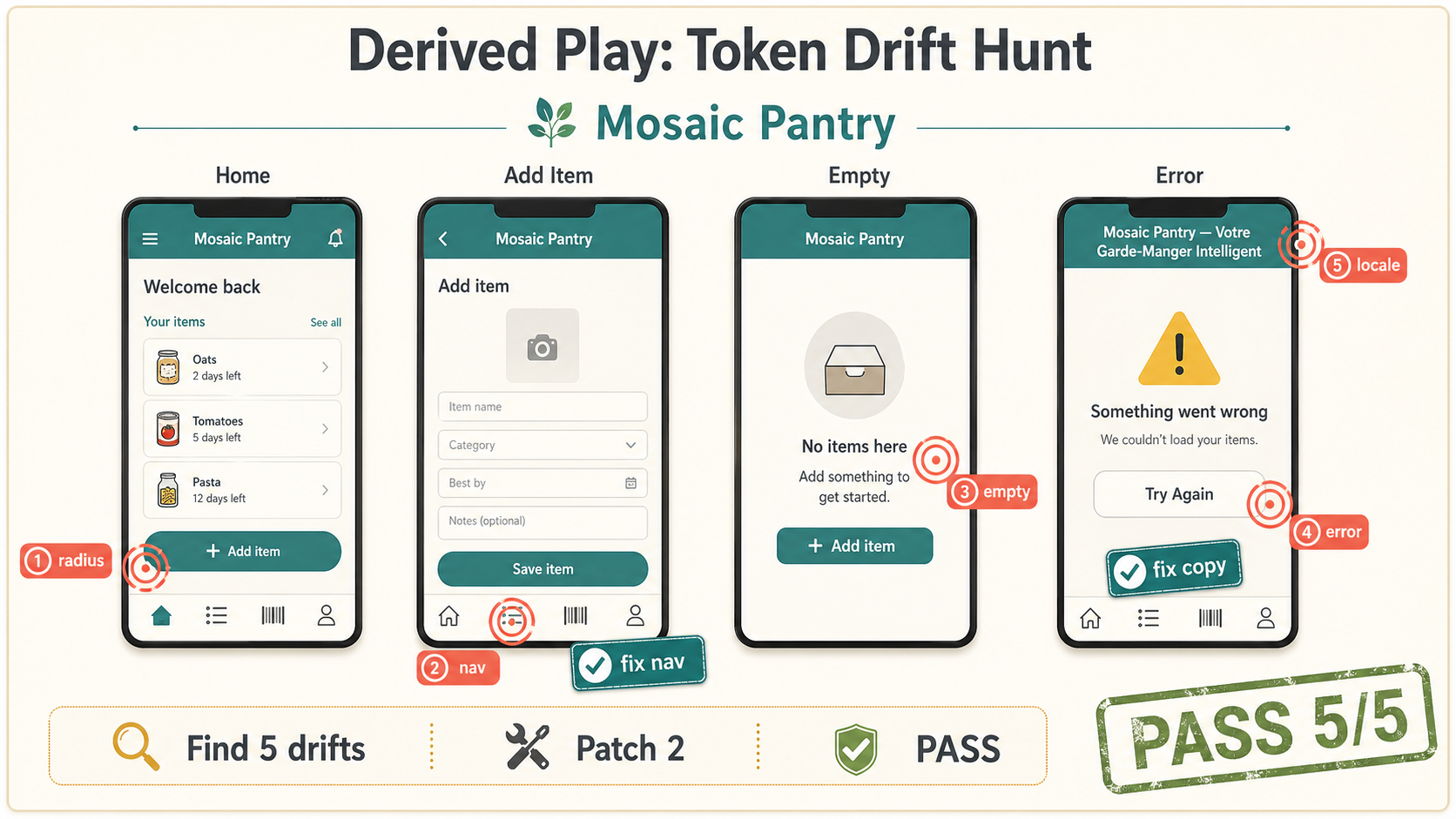
Create one polished public-gallery concept image titled exactly "Derived Play: Token Drift Hunt". Use case: ui-mockup / derived p...
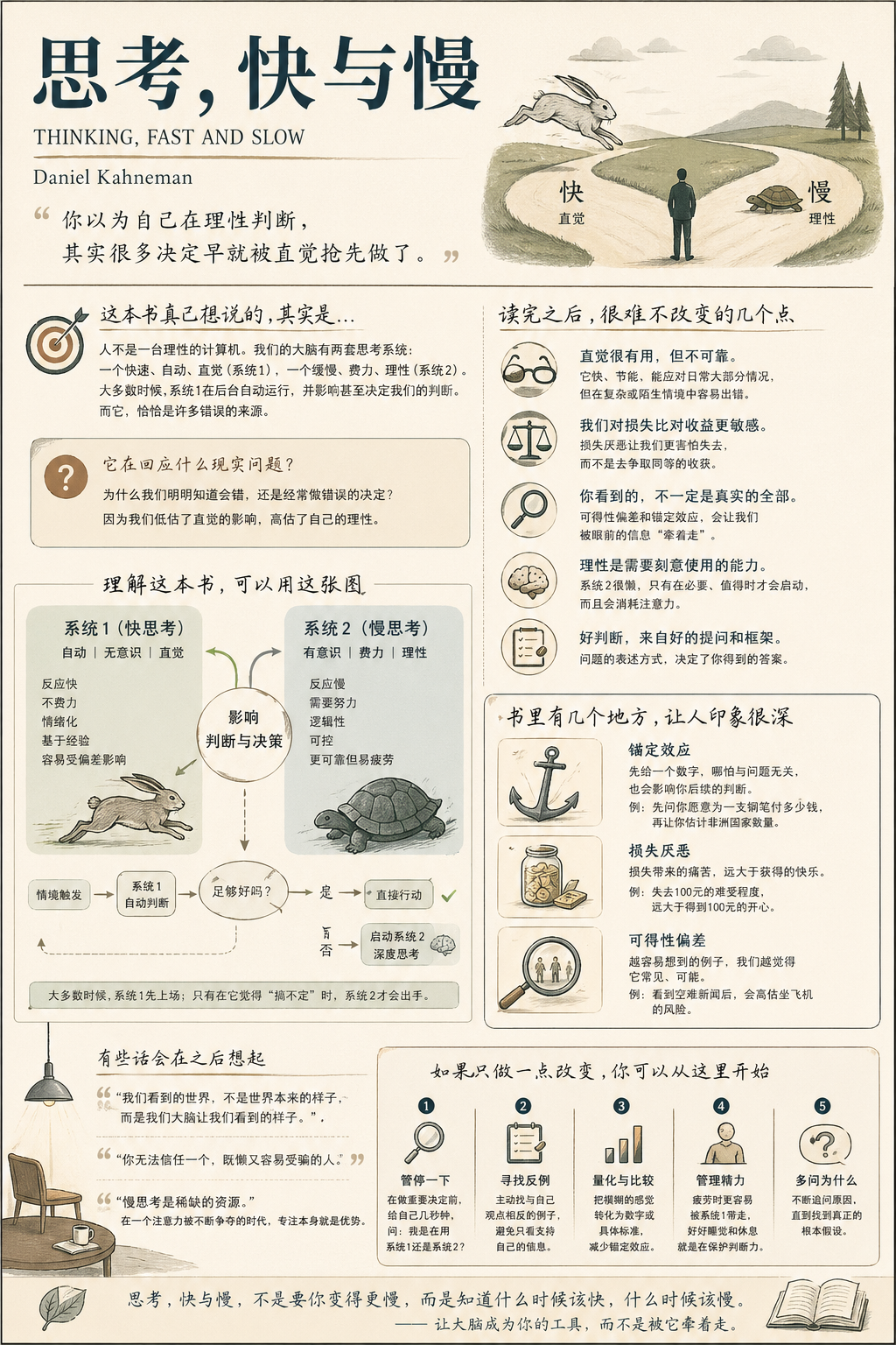
生成一张【中等信息密度】书籍总结信息图海报,主题为《思考,快与慢》。 Step 0(关键前置判断) 在开始生成之前,请先判断这本书更接近哪一类(可多选): 认知成长类(思维 / 自我提升) 商业 / 财富类(赚钱 / 职业 / 投资) 心理 / 情绪类(关系...
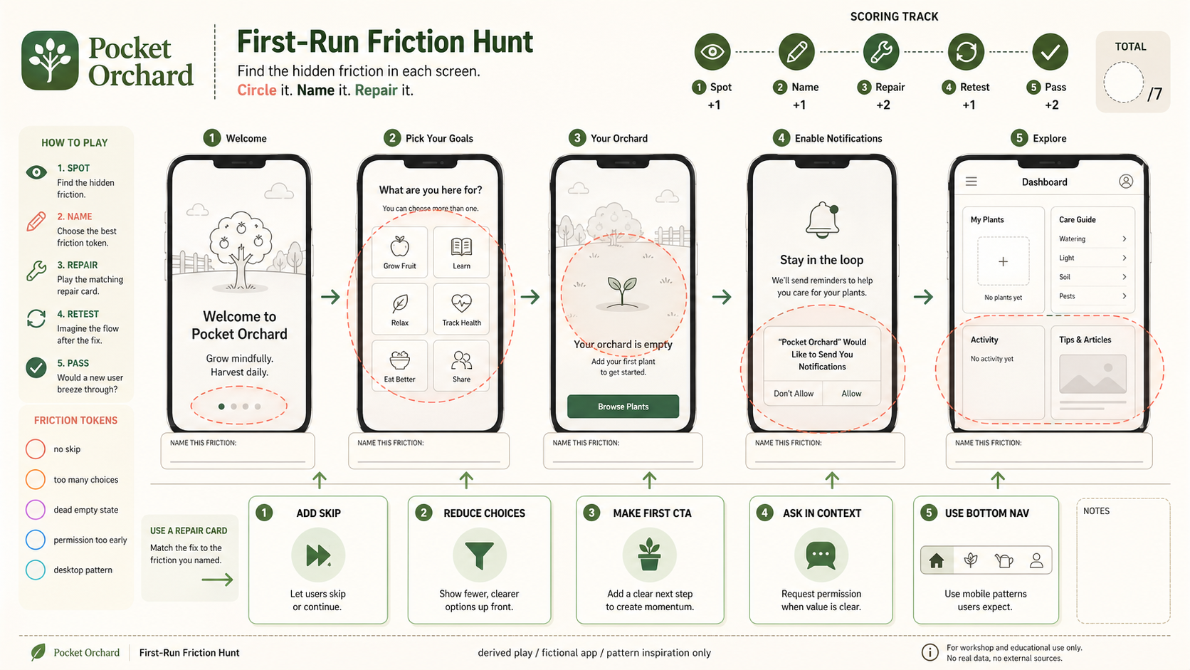
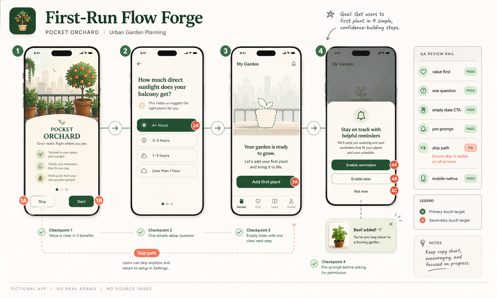
Use case: ui-mockup / derived play mechanic: first-run-friction-hunt Asset type: GPT Image 2 derived-play gallery image, wide 16:...
Use case: ui-mockup Asset type: GPT Image 2 use-case gallery image, wide 16:9 UX prototype review artifact Primary request: Creat...
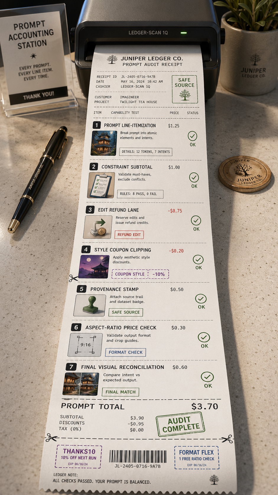
Use Case Receipt: Prompt Accounting Asset type: tall 9:16 thermal receipt and audit-ledger poster, not a grid, not a six-panel re...
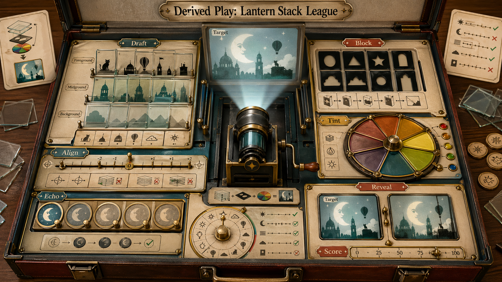
Use case: illustration-story / derived play mechanic: translucent-slide-rule-game Asset type: original derived gameplay concept i...