Use Case: Chart Narration Studio
Create one polished public-gallery concept image titled exactly "Use Case: Chart Narration Studio". Use case: accessibility mater...
从 Chart Narration Studio 派生出的无障碍玩法:玩家把图表描述卡匹配到 Title、Summary、Categories、Takeaway 的阅读顺序,并把 too vague 描述改写成 plain language。
Use this as a reference for Accessibility Review Game, Alt Text Relay, Chart Accessibility, Data Literacy workflows, prompt structure, visual constraints, and output review.
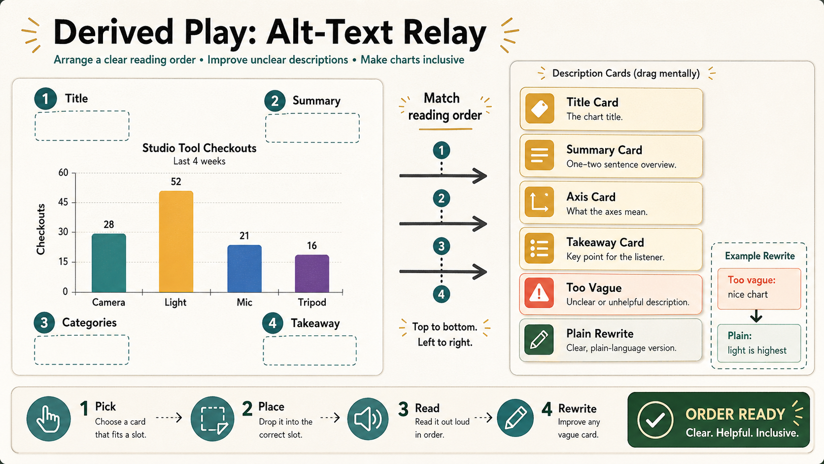
Create one polished public-gallery concept image titled exactly "Derived Play: Alt-Text Relay".

Use case: derived play mechanic / accessibility review game / data-literacy practice.
Asset type: landscape 16:9 printable challenge proof for a GPT Image 2 gallery.

Primary request: Derive a playable review game from Chart Narration Studio. Players match description cards to chart elements, arrange them into a correct screen-reader order, and rewrite one unclear card in plain language. This must be an accessibility narration game, not chart fact-checking, not a lie detector, not a data poster proof, not a dashboard, not a map, not a menu, not signage, and not a tabletop photo.

Fictional chart only: "Studio Tool Checkouts" with categories "Camera", "Light", "Mic", "Tripod". Keep data low-stakes and invented. Do not focus on numerical error hunting.

Composition: left side shows a clean chart preview with four numbered empty slots around it: "Title", "Summary", "Categories", "Takeaway". Right side shows six movable-looking description cards in a neat vertical stack, but rendered as a flat graphic proof, not physical cards. Card labels: "Title Card", "Summary Card", "Axis Card", "Takeaway Card", "Too Vague", "Plain Rewrite". Center lane has arrows and the instruction "Match reading order". Bottom game rail has four steps: "Pick", "Place", "Read", "Rewrite" and a final badge "ORDER READY". Include one small example rewrite card with readable short phrases: "Too vague: nice chart" and "Plain: light is highest".

Visual style: refined accessibility workshop graphic, crisp flat print design with warm white background, graphite text, teal slot numbers, amber cards, coral warning tag for "Too Vague", deep green final badge. Use subtle paper texture and exact alignment, but avoid school worksheet clutter. Typography must be short, clear, and legible.

Show the derived play clearly: generated chart assets become a human relay where people assemble alt-text reading order and improve vague descriptions.

Safety and originality constraints: no real datasets, no real brands, no logos, no public figures, no politics/elections/parties, no medical/legal claims, no harmful instructions, no adult or explicit content, no gore, no celebrity likeness, no copyrighted characters, no living-artist style imitation. Do not copy any external prompt, chart, layout, image, dataset, product UI, or source style.
Source note: Original fictional chart accessibility relay generated locally after external source sweep. Sources informed abstract infographic prompt structure, poster/text failure modes, chart prompt failure modes, chart accessibility requirements, and infographic-chart benchmark patterns only; no external prompt text, image, chart, dataset, product UI, brand, character, artwork, protected style, or source image was reused.
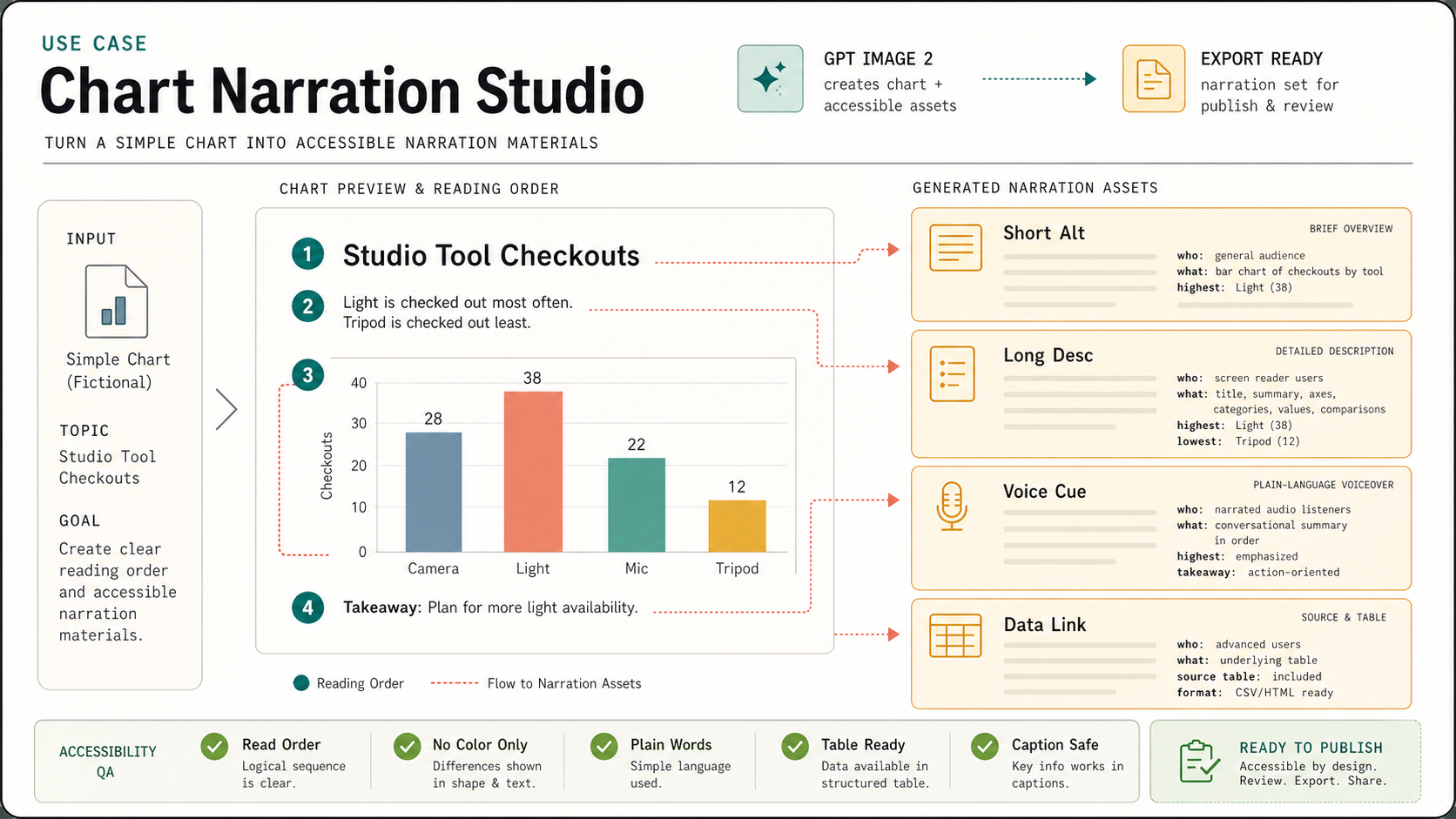
Create one polished public-gallery concept image titled exactly "Use Case: Chart Narration Studio". Use case: accessibility mater...
Derived play: productivity-visual / service-design QA game Asset type: public gallery image for GPT Image 2 derived-play research...
Create a wide 16:9 playable QA puzzle sheet titled in small clear text "Derived Play: Chapter Mismatch Relay". It is derived from...
Create a wide 16:9 playable puzzle sheet titled in small text "Derived Play: Blocking Bug Hunt". It is derived from the Rehearsal...
Create a polished, public-gallery image for a derived GPT Image 2 play mechanic. Use case: scientific-educational / derived play...
Create one polished public-gallery concept image titled exactly "Derived Play: BiDi Glyph Rescue". Use case: derived play mechani...