Derived Play: Receipt Run League
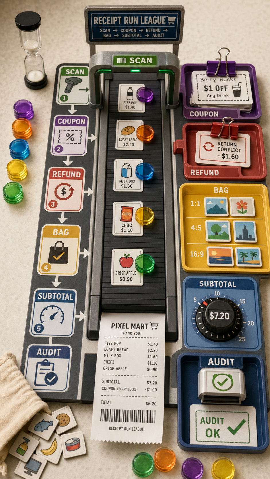
Derived Play: Receipt Run League Asset type: vertical 9:16 playable checkout-conveyor board game photograph, not a grid, not a si...
历史生成图,批次 019db8e3-caee-76e3-abe0-1aa1dd51a1ad,生成时间 2026-04-23 14:03:53。
可参考这个示例来设计 游戏化设计、光线与天气、材质研究、字体与排版 工作流、提示词结构、视觉约束和结果检查方式。
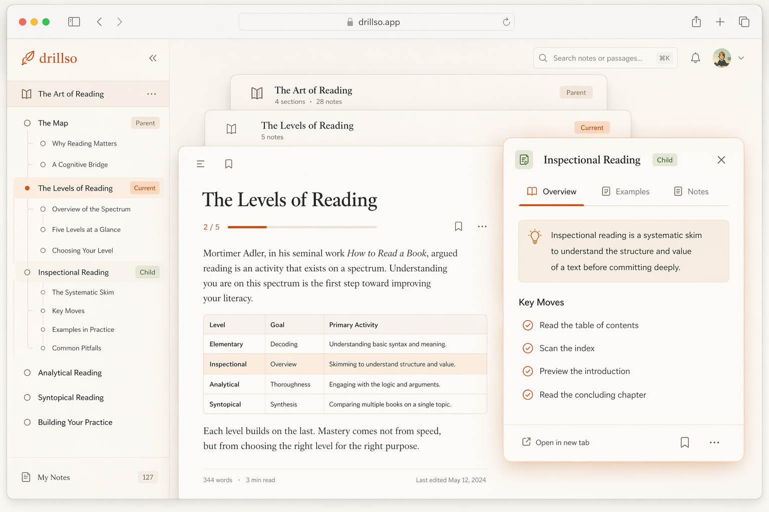
Use case: ui-mockup
Asset type: in-product desktop web app screen
Primary request: create a realistic software UI showing a reading app with parent/current/child three-layer node navigation in actual use.
Scene/backdrop: desktop browser screenshot of a calm knowledge-reading workspace.
Subject: left sidebar tree navigation, central reading canvas, and a layered node interaction. The parent card is tucked behind and peeking from the top, the current card is the main readable article surface, and the child node is opened as a modal sheet hovering above the current card with a slightly stronger accent and backdrop blur.
Style/medium: production-grade web app interface, modern editorial product UI, believable and usable, not concept art.
Composition/framing: straight-on desktop screenshot, slightly zoomed in so the three layers are obvious and tactile.
Lighting/mood: soft warm daylight, thoughtful, quiet, premium.
Color palette: oat cream, soft ivory, terracotta, sand, charcoal, tiny muted sage accents only if subtle.
Materials/textures: paper-like surfaces, rounded cards, fine borders, soft shadows, subtle modal overlay, restrained browser chrome.
Text (verbatim): minimal readable UI text only, mostly short headings and paragraph blocks, avoid lots of typography.
Constraints: reference a warm editorial website theme rather than a generic dashboard; light mode only; no dark mode; no purple; no neon; no glossy glass cards; no excessive charts; keep the hierarchy readable and calm; make the parent/current/child depth relationship the main design idea.
Derived Play: Receipt Run League Asset type: vertical 9:16 playable checkout-conveyor board game photograph, not a grid, not a si...
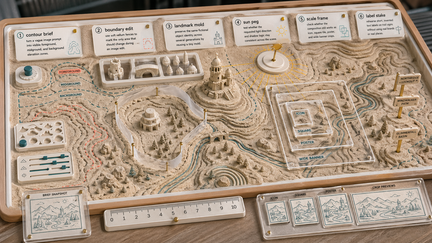
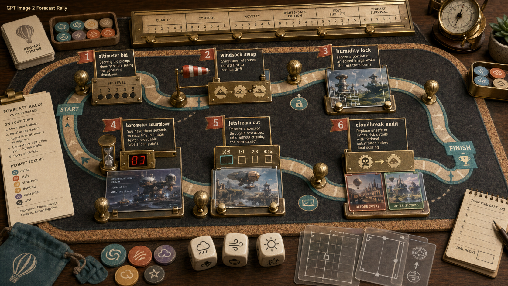
Create a wide 16:9 original GPT Image use-case concept scene titled "Use Case Sandbox: Contour Image Rehearsal". Purpose: visuali...
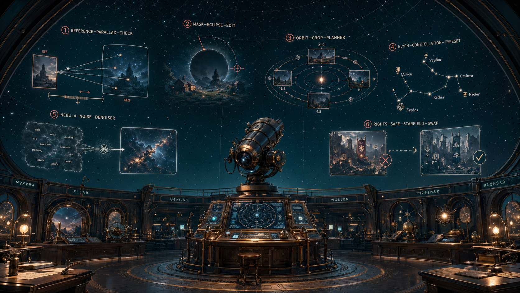
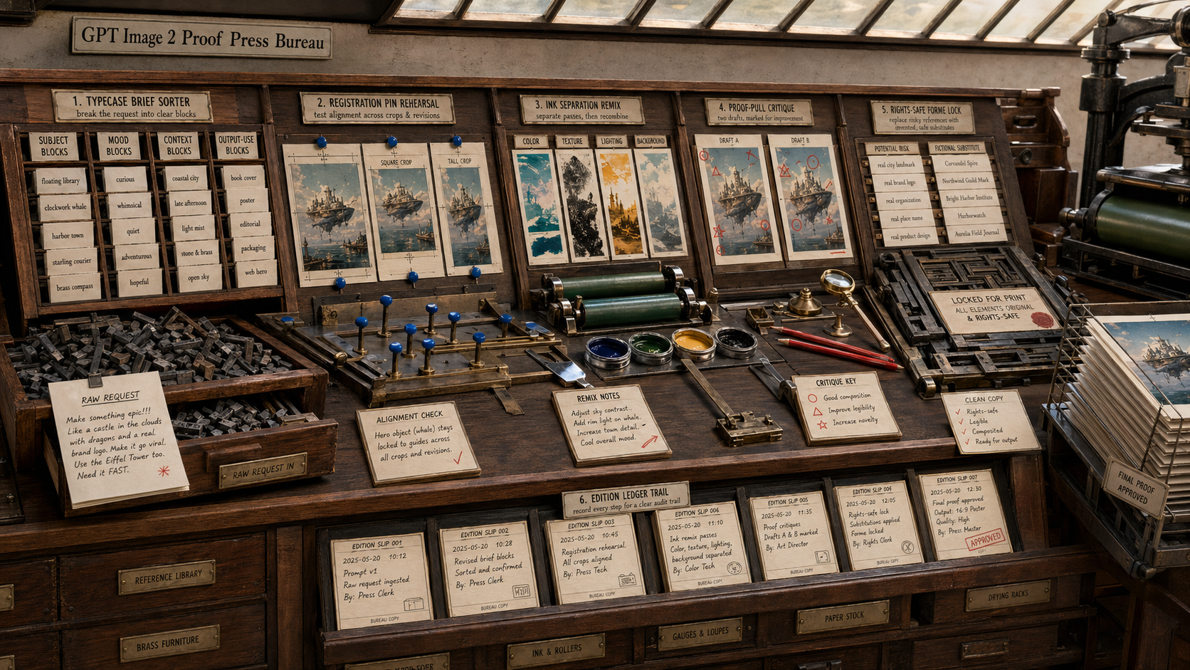
Create a single high-quality landscape concept image titled only through small fictional diagram labels, showing an original GPT...
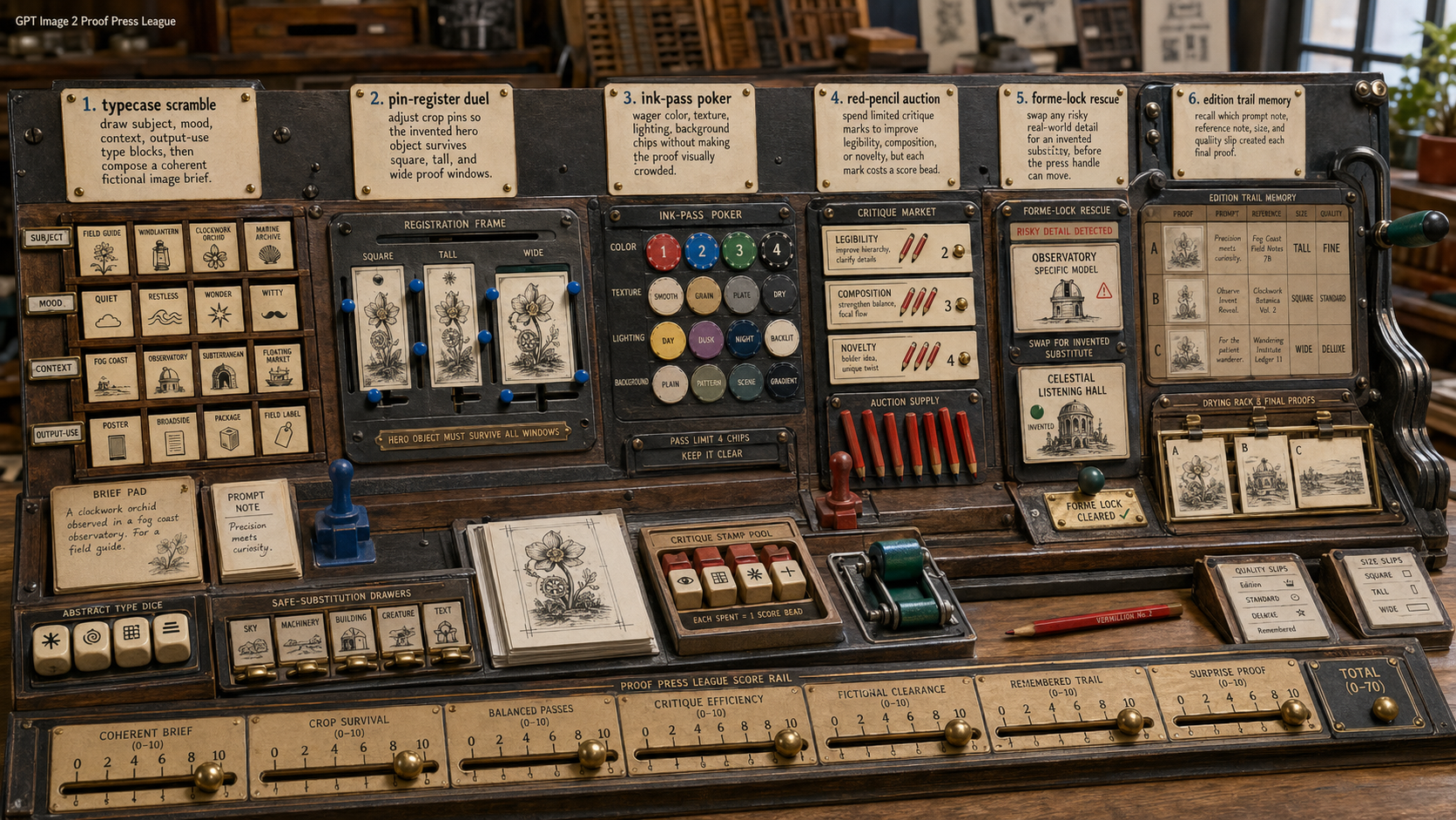
Create one original GPT Image 2 derived-play concept image as a 16:9 landscape scene. Title inside the image, small and legible:...
Create one original GPT Image 2 use-case concept image as a 16:9 landscape scene. Title inside the image, small and legible: "GPT...
Create one original GPT Image 2 derived-play concept image as a 16:9 landscape scene. Title inside the image, small and legible:...