Derived Play: Receipt Run League
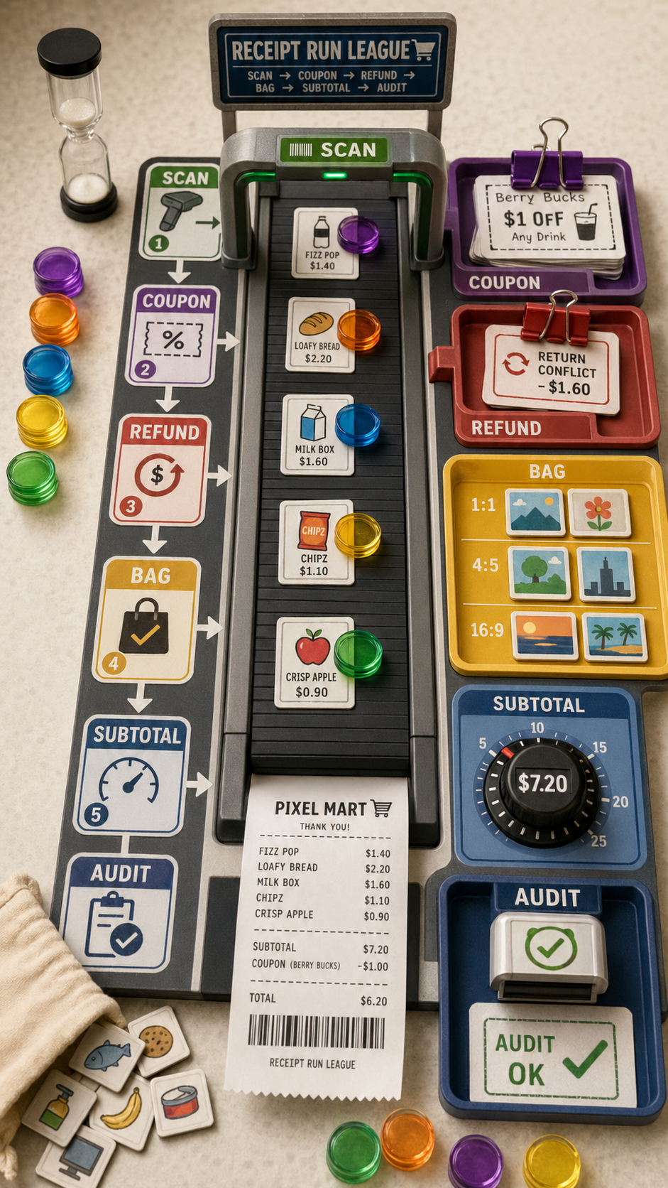
Derived Play: Receipt Run League Asset type: vertical 9:16 playable checkout-conveyor board game photograph, not a grid, not a si...
历史生成图,批次 019db8e3-caee-76e3-abe0-1aa1dd51a1ad,生成时间 2026-04-23 14:29:45。
可参考这个示例来设计 游戏化设计、光线与天气、产品样机、UI 界面 工作流、提示词结构、视觉约束和结果检查方式。
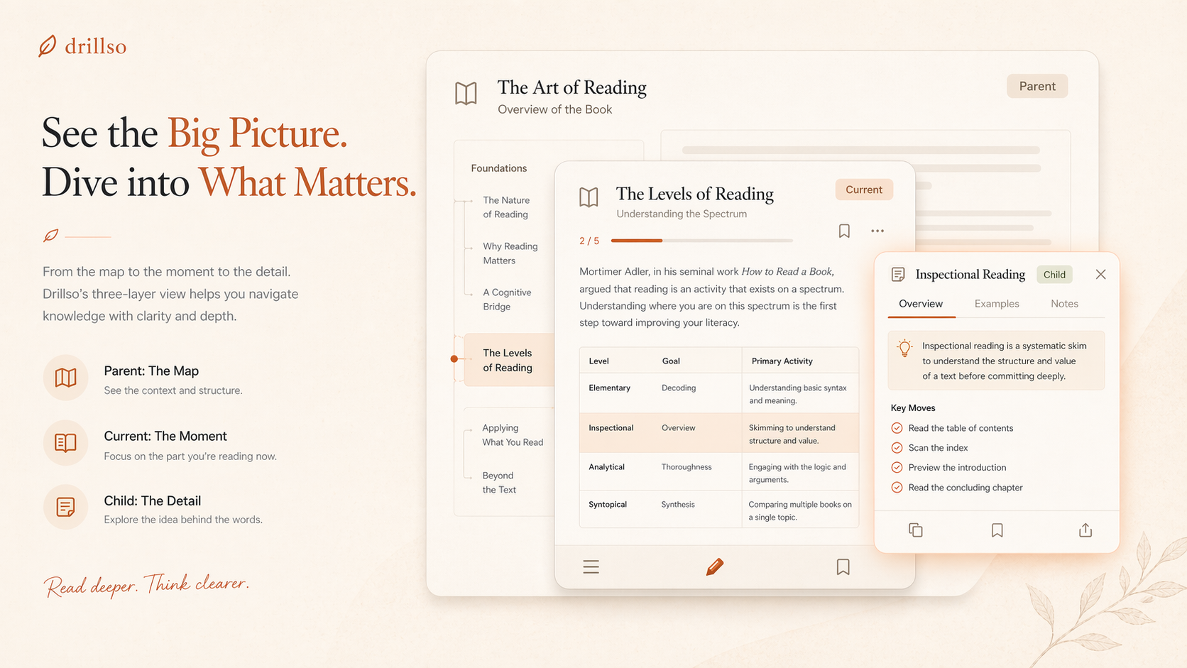
Use case: ui-mockup
Asset type: landing page hero showcase for a reading and knowledge app
Primary request: create a corrected marketing UI design showing a three-layer node concept with proper physical card hierarchy. The parent card is the largest card in the stack, the current card is a medium card centered above it, and the child card is the smallest floating foreground card. The size relationship must be obvious immediately.
Scene/backdrop: warm editorial landing page section on a soft oat-cream background with faint paper grain and restrained radial light.
Subject: three nested content cards representing parent, current, child. Parent is the broadest and tallest background card with overview structure. Current is a smaller middle card with focused reading content. Child is the smallest compact detail card hovering in front.
Style/medium: premium SaaS product mockup, refined editorial interface, believable Figma-quality composition.
Composition/framing: desktop hero composition, left side brief value proposition text, right side stacked card mockup. Parent visibly spans the widest area, current is clearly inset, child is clearly the smallest accent card.
Lighting/mood: soft daylight, warm, calm, intelligent.
Color palette: bone, cream, sand, terracotta, muted amber, charcoal.
Materials/textures: paper-like cards, thin warm borders, soft shadows, subtle terracotta highlight around the smallest child card only.
Text (verbatim): tiny labels allowed: Parent, Current, Child.
Constraints: parent must be largest card, current medium, child smallest; light mode only; no purple; no dark mode; no glassmorphism; no neon; no clutter; keep the current website's warm literary style.
Derived Play: Receipt Run League Asset type: vertical 9:16 playable checkout-conveyor board game photograph, not a grid, not a si...
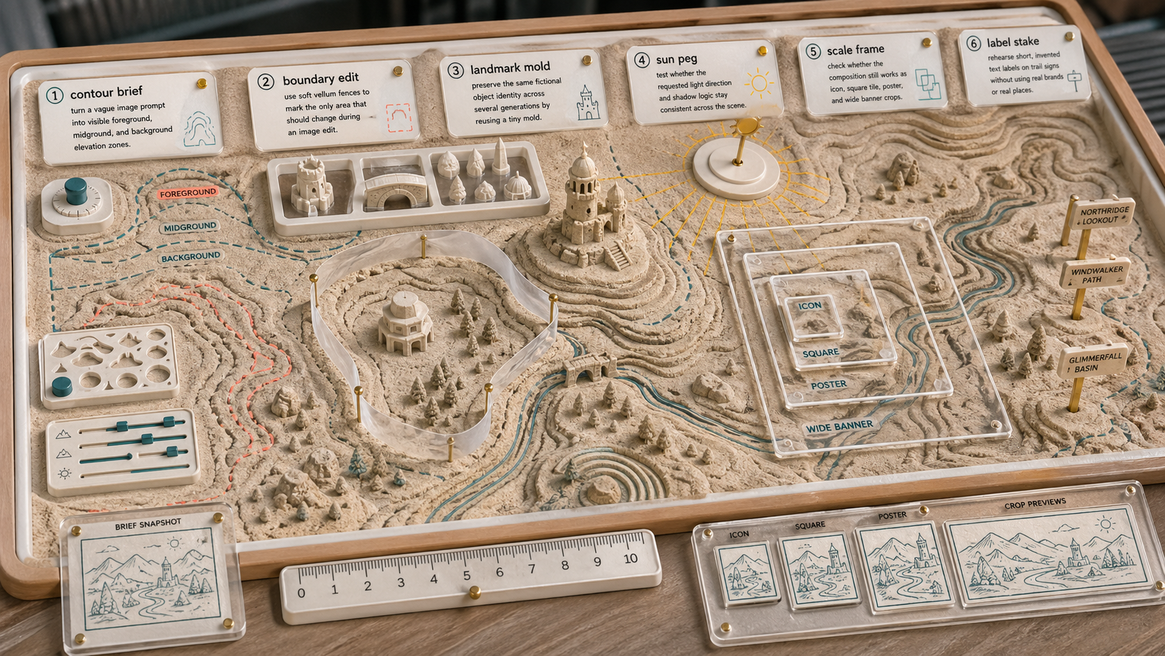
Create a wide 16:9 original GPT Image use-case concept scene titled "Use Case Sandbox: Contour Image Rehearsal". Purpose: visuali...
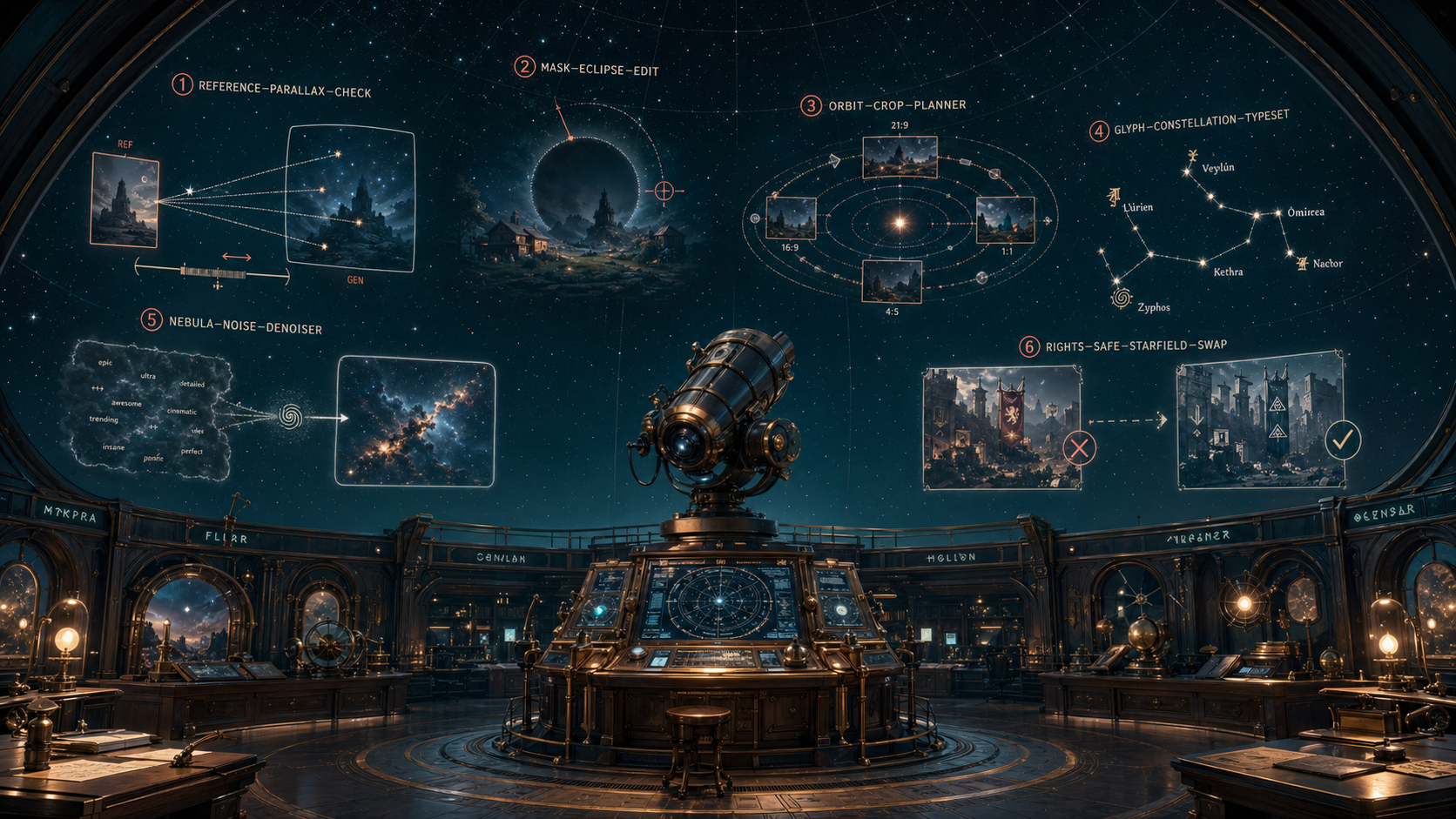
Create a single high-quality landscape concept image titled only through small fictional diagram labels, showing an original GPT...
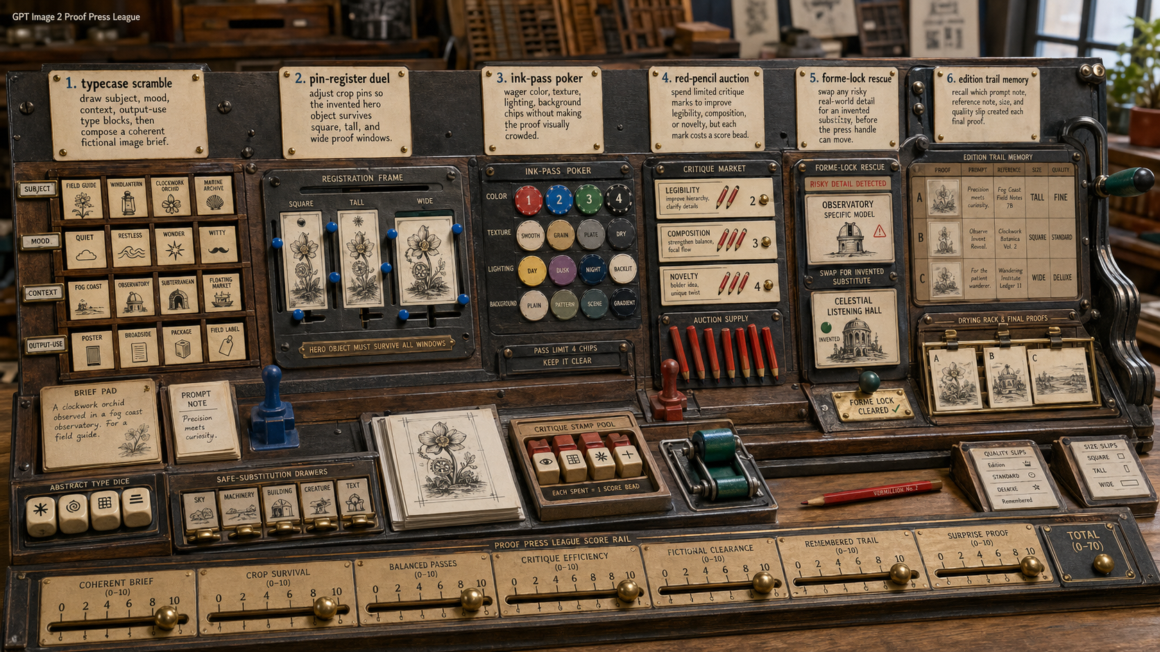
Create one original GPT Image 2 derived-play concept image as a 16:9 landscape scene. Title inside the image, small and legible:...
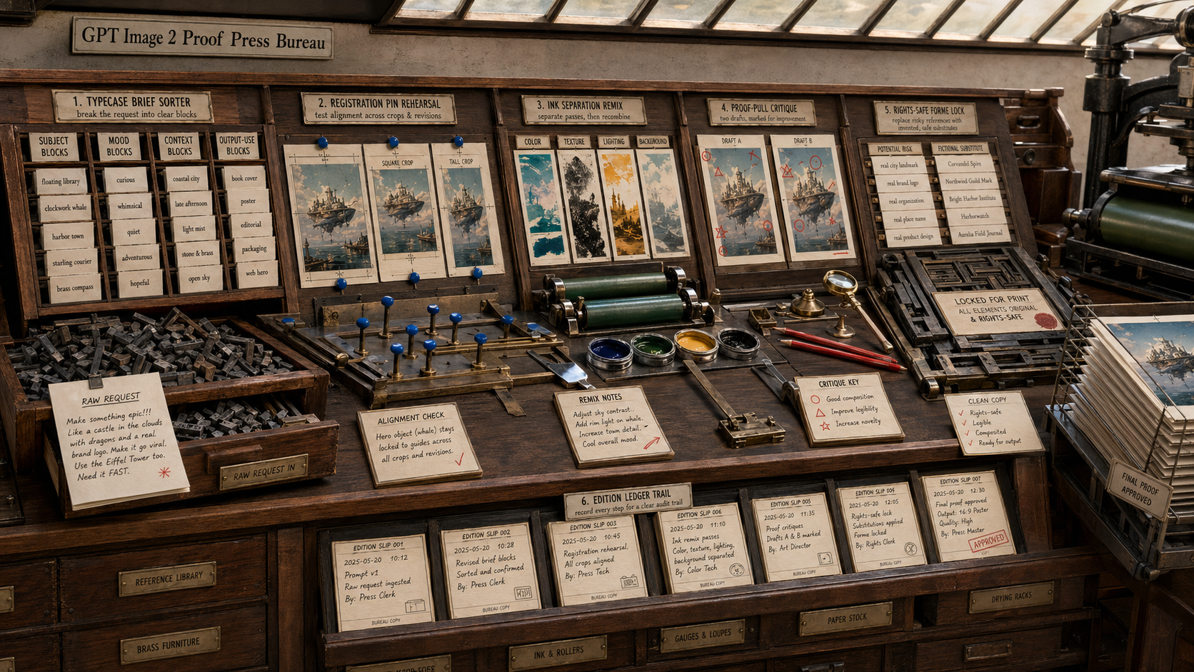
Create one original GPT Image 2 use-case concept image as a 16:9 landscape scene. Title inside the image, small and legible: "GPT...
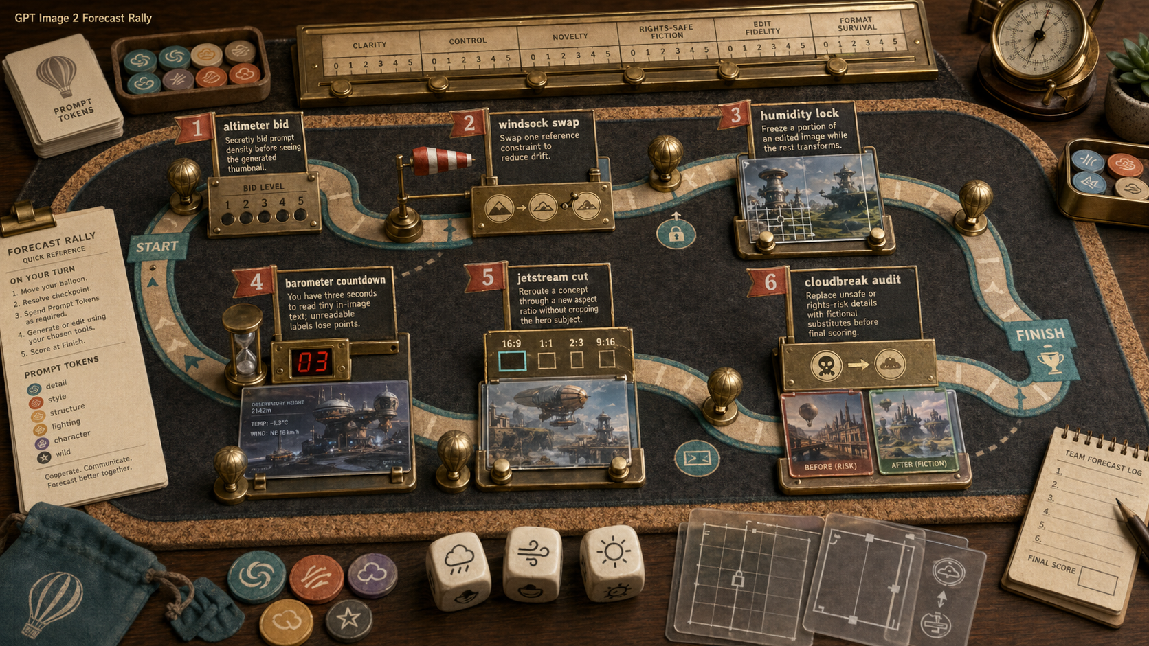
Create one original GPT Image 2 derived-play concept image as a 16:9 landscape scene. Title inside the image, small and legible:...